Sulos is a startup that prevents palliative care patients from returning to the hospital and improves the quality of care. They do this with remote patient monitoring solutions for palliative care organizations. These solutions track patient health and provide timely support, reducing hospital readmissions and improving care.
Services
Product Design, Product Strategy, User Research, Design QA, Prototyping, and Visual Design.
Team
Natasha August - Head of Product, Paul Brown - Delivery Lead, Josh Radecki - Dev Leader, and Natalie Frecka - Sr. Developer.
Narrative
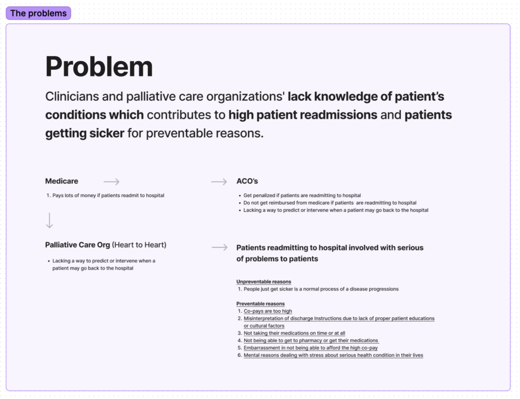
Readmissions to the hospital in palliative care can be either preventable or unpreventable. While the natural decline of a seriously ill patient is often inevitable, many patients return to the hospital due to preventable causes such as failure to take medication, incorrect medication use, high co-payments, and a lack of knowledge about the patient’s condition by healthcare providers after discharge. By addressing these issues, we can reduce the number of preventable readmissions and improve the quality of care for palliative care patients.
Problem & solution space
Palliative care organizations often lack knowledge of patients’ conditions after they are discharged from the hospital.
There are few tools available to intervene when a patient’s condition is deteriorating.
Patients may face difficulty accessing pharmacies to obtain their medication.
Care teams lack effective tools to respond to patients’ requests, and there are few intuitive tools that can help engage patients and allow them to report their symptoms.
Project goals
Develop a prioritization system to identify which patients require immediate assistance.
Create a patient questionnaire experience that captures daily symptom reports.
Develop an improved admin toolbox to help palliative care organizations manage their patients.
Overall goal: Prepare all three apps for pilot testing and onboard the first client.
Strategy
Challenges
The problem is complex and time is limited.
It is necessary to provide context and value to users without relying on electronic health records (EHRs) for the minimum viable product (MVP).
There are limited design resources available.
Solving complex problems requires careful planning and analysis.
Tactics
Use the double diamond model in the design process, devoting 70-80% of the effort to user research to identify and validate the right problem. The remaining time will be used to evaluate the solution we build to ensure it is effective.
Use real customer data from the pilot phase to define Phase 2 of the project.
Research
Conduct qualitative one-on-one conversations with clients to gather feedback.
Use surveys to gather additional feedback and data.
Prior experience
Outdated screens with cumbersome navigation, limited functionality, and inadequate user-centered design.
The home screen’s list of patients did not provide meaning or context and did not represent priority patients, making it hard for the team to prioritize.
The patient profile was not responsive or accessible, and did not present the patient information in a meaningful way. It also lacked the ability to edit patient information or set rules for prioritizing patients. These issues made it difficult for the user to effectively manage and track patient information.
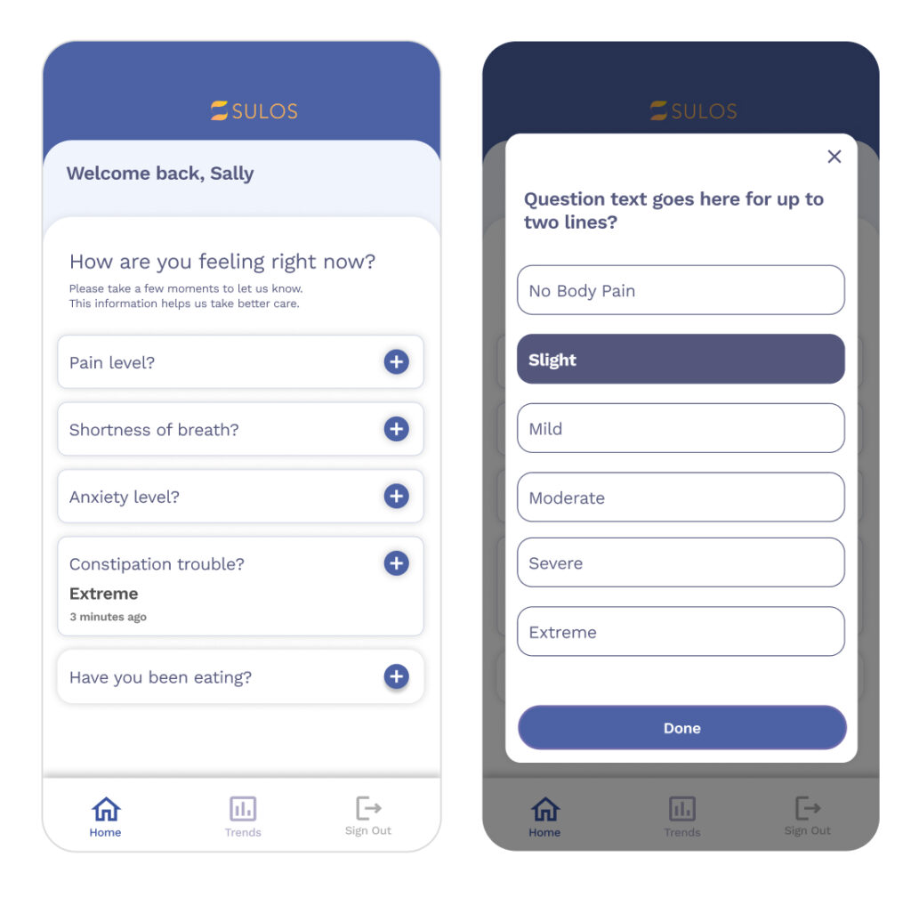
Patient questionnaire
The patient questionnaire had an uninviting design that was not user-friendly. It did not provide clear information about what would happen after a patient reports symptoms or what to do if they feel a symptom that is not on the list.
Process
Highly Iterative involving ideation, design exploration, research, and collaboration with an external advisor.
Design
Patient prioritization
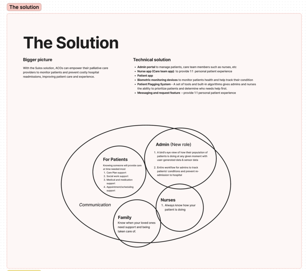
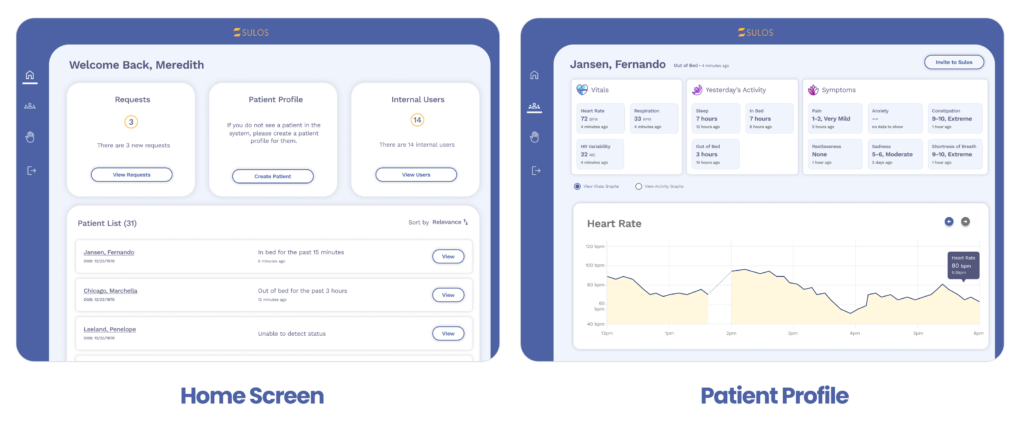
The first step in our project was to plan a patient prioritization feature that would help care teams get a bird’s-eye view of their patient population and determine who needs help first using a data-driven approach. The priority patients would be a list of patients displayed using hard-coded logic, and would be visible to both care team members such as nurses, as well as palliative care organization admins.
How did we know what to design?
Our design process was guided by valuable insights from exploratory research conducted among palliative care organizations. This research highlighted the need for remote patient monitoring tools that keep nurses and administrators informed about patient conditions.
Definition
To achieve maximum alignment within the team, I started off by mapping out and defining the key terms and concepts that were brought up in our earlier discussions.
What are ‘patient flags’?’ Patient flags are a set of tools and algorithms that enable admins and nurses to prioritize patients and determine who needs help first in a data-driven way.
Who are they for?
Admins who want to get a bird’s eye view of their patient population and track their health status
Nurses who want to see how their patients are doing and be notified when their condition improves or worsens, or when they haven’t reported any symptoms.
What are ‘patient thresholds’? Patient thresholds are clinical parameters that are created and edited by the admin to determine a patient’s baseline condition. Setting thresholds is like creating ‘rules’ for when a patient will have a flag and when they will not.
Priority patient values
I created this pyramid to reflect the core values and hierarchies of patient flagging. In a nutshell, self-reported symptoms such as severe or extreme, or app inactivity, determine whether a patient is at high risk and therefore becomes a priority patient. This pyramid helps to visualize the importance of these factors and how they contribute to the overall prioritization of patients.
Hard-coded scoring configuration
Scores are calculated based on self-reported symptoms and biometric data. We worked closely with clinical advisors such as physicians and nurse practitioners to ensure the design of this feature accurately reflects clinical expertise.
Patient and admin apps
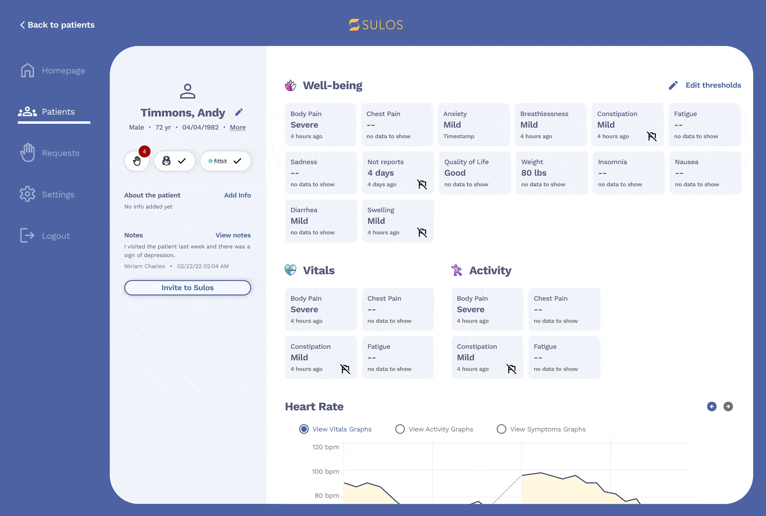
The patient app and admin portal were designed to integrate seamlessly with the Patient Flagging System, providing a smooth and intuitive experience for users. This integration allows admins and nurses to easily access and review patient data, as well as prioritize patients based on their needs.
Priority patient table
The priority patient table was designed to help nurses make better data-driven decisions, not to replace clinical judgment. The table utilizes a scoring system, biometric data, and other parameters to surface patients who either report symptoms or haven’t due to inactivity.
Filter & sort
Sorting or filtering prioritized patients required a deep understanding of different conditions and clear definitions of criteria. Nurses played a vital role in providing insights on who they wanted to see first.
The journey of a flag
Sorting or filtering prioritized patients required a deep understanding of different conditions and clear definitions of criteria. Nurses played a vital role in providing insights on who they wanted to see first.
Design
Patient flagging
This feature enables palliative care organizations to prioritize patients based on their specific condition and receive notifications when a patient reports a symptom. It was a challenging feature to build, involving multiple feedback loops and refinement sessions with nurses and clinicians.
Design
New patient questionnaire
1. Identifying issues
The previous system had outdated screens with cumbersome navigation, limited functionality, and inadequate user-centered design.
2. Design exploration
Aligned with the team, we explored high-level designs for an engaging questionnaire.
Research & Validation
Exploratory research
I planned a user research study with 12 participants and interviewed them over the course of 2 weeks.
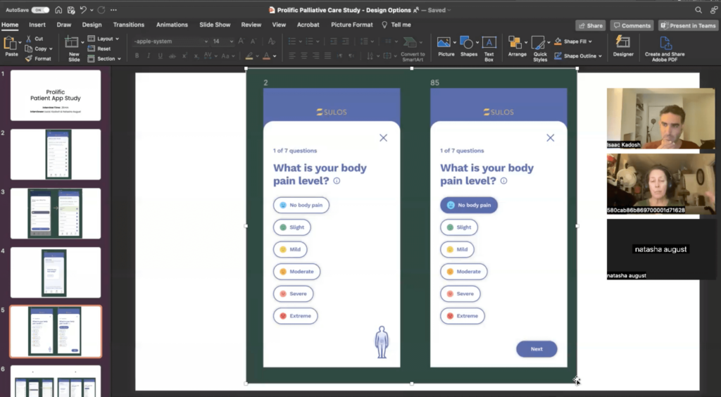
Each participant was initially presented with design option 1 and we showed them multiple screens, asking questions along the way. Then they were presented with option 2, and finally we asked them questions comparing the two options.
Key insights 🤔
Based on the feedback from participants, the majority preferred Option B because the design was more intuitive and user-friendly.
Most participants wanted to know what would happen after they answered the questions and why they were being asked to answer them.
The majority of participants said that they liked Option A because it provided all the symptoms on one page, which they found more efficient.
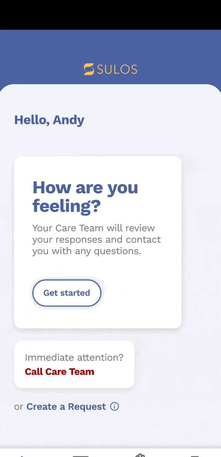
Most participants expected that when they clicked the “get started” button, it would show a list of symptoms or take them through a questionnaire.
Almost all participants believed that the illustration image was clickable and would allow them to point to the specific location of their pain.
The majority of participants expected that when they clicked the “next” button, it would show the next symptoms on the list or the next step in the questionnaire.
Deliverables
Final screens built by engineers
Patient questionnaire
We decided to create a third option for patients to select multiple symptoms and generate relevant questions. We also wanted to provide the option for patients to report current and non-current symptoms to their healthcare team. becomes a priority patient. This pyramid helps to visualize the importance of these factors and how they contribute to the overall prioritization of patients.
Admin portal
The new admin portal experience includes several deliverables, such as improved screens for requests and the home screen, but the most important feature is the ability for admin users to set rules and prioritize patients.
Preparing for pilot
We developed a 9-week pilot plan to onboard our first customer to use the admin portal. The main goals of the pilot were to validate the value of the features we had built for the customer and to identify any issues or gaps in the user experience. We held weekly one-on-one sessions with the customer to gather their feedback, learn about their experience, and test various features.
Results and metrics
🙌
Increase in customer satisfaction
Positive insights emerged from the interviews, with customers indicating that they are satisfied with the set of features in the admin portal used to manage patients. Additionally, they reported feeling ready to start creating patient profiles in the system and inviting their patients to use it.
🎉
New client acquisition
Demoed and presented the product to 5 prominent patient care organizations, resulting in the acquisition of 5 new customers and driving substantial business growth.
Learnings
Onboarding was smooth: Customers provided positive feedback about the guiding documents and training materials we provided.
Customers requested the ability to upload medical documents, such as medication lists.
They also requested a calendar feature to set appointments for patients with physicians.
Customers also mentioned the need for a notes feature to add additional details to patient profiles.